ShopDreamUp AI ArtDreamUp
Deviation Actions


Description
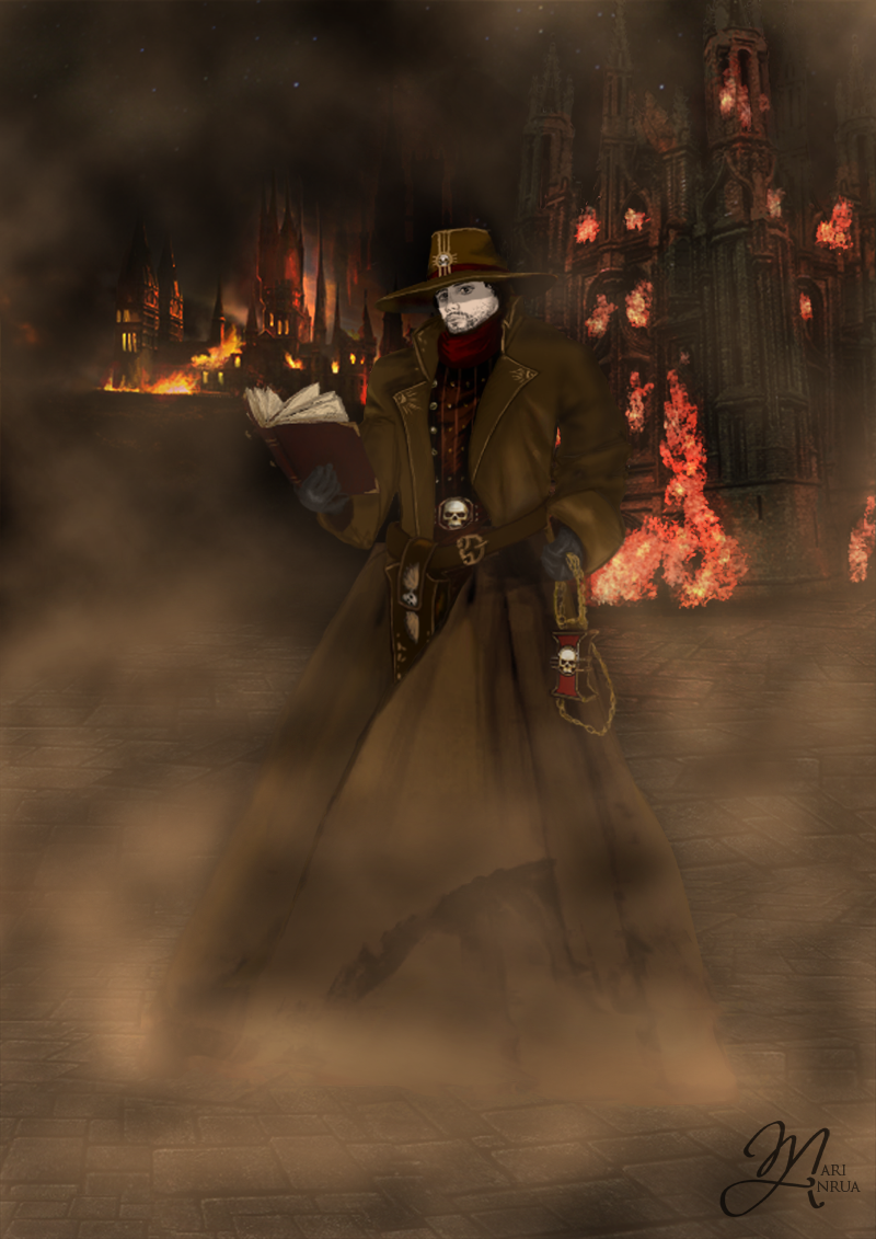
Drawn for an institute exam 1st year of study, 2011.
Photoshop CS2. GENIUS G-Pen 560
Essay on character:
"His radicalism is born from a feeling of compassion for ordinary people. He's similar to inquisitor Skane (Tyrant Cabal from Dark Heresy) she - follows the Recongregators’ creed, which states that the Imperium must be reformed radically to reduce the suffering of its people and that the Inquisition is the only body with the authority and skill to reform it.
I really like the idea of decent and humane Throne Agent. It's make the Dark Millennium of Warhammer even grimmer, cause characters like Inquisitor Zellari, do not live long and glories lifes, and always dies alone in the dark, where no one will ever know or see. "
Image size
800x1131px 1.02 MB
© 2012 - 2024 MariAnrua
Comments173
Join the community to add your comment. Already a deviant? Log In
Vision: It's apparent you had a strong idea for what you wanted to put on the canvas here, and that you kept it mind throughout. Composition is good, and figure is presented properly.
Originality: You managed to put your own unique spin on this style of character which is a nice accomplishment and not always easy to do. While drawing upon classical characters and character archetypes you manged to visually set yours apart great job.
Technique: Let me start by saying, your technique and fundamentals are great. I don't take the time to critique pieces that I do not like. If I come across harshly, I'm not intending to. It is just easier to notice things as an observer than it is as the creator. With that said:
Anatomically, I feel like his right shoulder should be pulled back more and his left shoulder should be forward more due to where the center of his chest/torso are.
On the note of his coat, it seems you used a slightly different color above and below his belt. The brown on top is slightly warmer/more saturated than below just enough that my eye is picking it up. Also below the belt the jacket seems unnaturally wide as if it were inflated or had structures in it to keep it rigid as opposed to just hanging against his legs. Similarly, the left part of his jacket coming so far over and covering so much seems to not mesh with the rest of the folds presented.
Another slight disconnect, the amount of shading and value you put in his clothes is a lot more than what you put on his face where the only shadow present is from the brim of his hat and there are no highlights. It makes it look kind of pasted on compared to his studded shirt and jacket which have quite a bit of value work in them. I would also like to see a lot more higher contrast and dynamic shadows and highlights being that the light source is raging fires drastic shadow with lots of difference between darks and lights would be present. One more thing on the constructive side of things, the smoke effect you used looks kind of generic and two dimensional, and I think there's too much of it. It obscures a lot of detail and appears to be a border painted on a two dimensional image. It would look more convincing if you did away the smoke around the characters head level/ the center of the picture and made it so it was in the sky above the fires in the background and hanging lower to the ground in the foreground. I apologize if all that sounded knit picky or made it sound like I don't like this picture cause I really do. You're conveyance and design are excellent, and its clear you've been studying progressive mindedly for quite some time. It really looks better than any digital paintings I've done, just some minor tweaks I saw/ food for thought for the next time around.
Impact: I feel as though you had an idea in your mind and saw it through to completion. We see a striking, stark figure in a dire setting where his face and posture in such circumstances show a good bit of his character to the viewer. A bold well executed illustration. Keep up the good work!